


Visual testing checks what a user actually sees: whether the page looks right, not just whether it works. A functional test can confirm that a button exists and responds to a click while the button sits hidden under a banner. A visual test compares a screenshot of the page with an approved baseline and flags the difference.
To show where each kind of test earns its place, we built one small product page and broke it five ways on 29 October 2026. We ran a functional check and three visual checks against every version in Chromium and Firefox with Playwright 1.64.1. The functional check passed all ten times. The default visual check failed on both real defects, stayed quiet on a colour change no person could see, and raised a false alarm on a live clock until we masked it.
Why visual defects slip past functional tests
Functional tests ask questions about the page structure: does this element exist, does it contain this text, does it respond to a click? They do not ask how the page looks. That gap matters because people judge software by what they see. Rather than quote survey figures we could not verify, we show the effect directly in the experiment below.
The Cypress documentation on visual testing puts the gap plainly: "an application can pass every functional test and still ship visibly broken." It lists the usual causes, including a CSS change that misaligns elements, a brand colour that renders wrong and a font that silently falls back to a default.
Layout, colour and overlap need checking by QA experts or by tests that look at the rendered page. Otherwise a release that passes every check can still drive users away.
Also Read: Best Practices for Streamlined Quality Testing to Reduce Churn Rate
How visual testing works
Visual testing, also called visual regression testing, sits alongside UI/UX testing: it automates the part of a UI review that compares how the page looks now with how it looked when it was approved. Every tool follows the same three steps.
- Capture. The test drives the application to a known state and takes a screenshot of the page or of one element.
- Compare. The screenshot is compared with a stored baseline, pixel by pixel. If more pixels differ than the test allows, it fails.
- Review. A person looks at the difference. An unintended change is a bug. An intended change becomes the new baseline.
The review step is what separates a useful visual suite from a noisy one. A visual test cannot know whether a change was meant, so it hands that decision to a person, with the evidence attached.
A note on terms: in engineering, "visual testing" also names a non-destructive testing method, inspecting materials and welds by eye. That meaning has its own standards, such as ISO 17637:2016 for fusion-welded joints, and it is not covered here. This guide is about software.
The baseline is the contract
Playwright creates the baseline on the first run. Its Visual comparisons guide explains that toHaveScreenshot() "took a bunch of screenshots until two consecutive screenshots matched, and saved the last screenshot to file system". Later runs compare against that file, and you update it with npx playwright test --update-snapshots when the design changes on purpose.
Treat baseline images like code. Commit them, review changes to them in the same pull request as the change that caused them, and never update them just to make a failing build pass.
Also Read: QA Testing for Tech Startups: Challenges and Solutions
Our experiment: one page, five changes, four checks
The page is a single product card: a name, a price, a short description, an Add to basket button and a "prices checked at" timestamp. A small local server returns the same card with one controlled change at a time:
- No change, to prove the tests pass on the baseline.
- Colour tint: the heading and price colour moved from #1c1b21 to #1e1d23, two units per colour channel.
- 2 px shift: the card's padding grew from 16 px to 18 px at the top and bottom, which moves everything inside it down 2 px.
- Hidden button: a promo banner was placed over the Add to basket button, with
pointer-events: noneso clicks still pass through it. - Live clock: the timestamp shows the current time on every load.
The tests
Each test file runs four checks against whichever version the VARIANT variable selects. The functional check confirms the button is visible and clickable. The visual checks compare the page with the baseline at the default settings, with the timestamp masked, and at a strict colour threshold of 0.
// Each test compares one variant of the page against the same baseline ("card.png").
// Run 1 with --update-snapshots on ?v=base creates the baseline; later runs compare.
const { test, expect } = require("@playwright/test");

const BASE = "http://localhost:4256/";
const variant = process.env.VARIANT || "base";

test("functional check: the button is visible and clickable", async ({ page }) => {
  await page.goto(`${BASE}?v=${variant}`);
  await expect(page.getByRole("button", { name: "Add to basket" })).toBeVisible();
  await page.getByRole("button", { name: "Add to basket" }).click({ trial: true });
});

test("visual check: the card matches the baseline", async ({ page }) => {
  await page.goto(`${BASE}?v=${variant}`);
  await expect(page).toHaveScreenshot("card.png");
});

test("visual check with the timestamp masked", async ({ page }) => {
  await page.goto(`${BASE}?v=${variant}`);
  await expect(page).toHaveScreenshot("card-masked.png", { mask: [page.locator("#stamp")] });
});

test("visual check at threshold 0 (strict colour)", async ({ page }) => {
  await page.goto(`${BASE}?v=${variant}`);
  await expect(page).toHaveScreenshot("card-strict.png", { threshold: 0 });
});
The configuration runs every test in Chromium and Firefox at a fixed 360 by 360 pixel viewport:
const { defineConfig } = require("@playwright/test");
module.exports = defineConfig({
  testDir: "./tests",
  reporter: [["list"]],
  use: { viewport: { width: 360, height: 360 } },
  expect: { toHaveScreenshot: {} },
  projects: [
    { name: "chromium", use: { browserName: "chromium" } },
    { name: "firefox", use: { browserName: "firefox" } },
  ],
});
We created the baselines once with --update-snapshots on the unchanged page, then ran the suite against each version. Four checks, two browsers and five versions make 40 results. Figure 1 shows Chromium; Firefox matched every pass and fail.
What visual testing caught
A button nobody could see
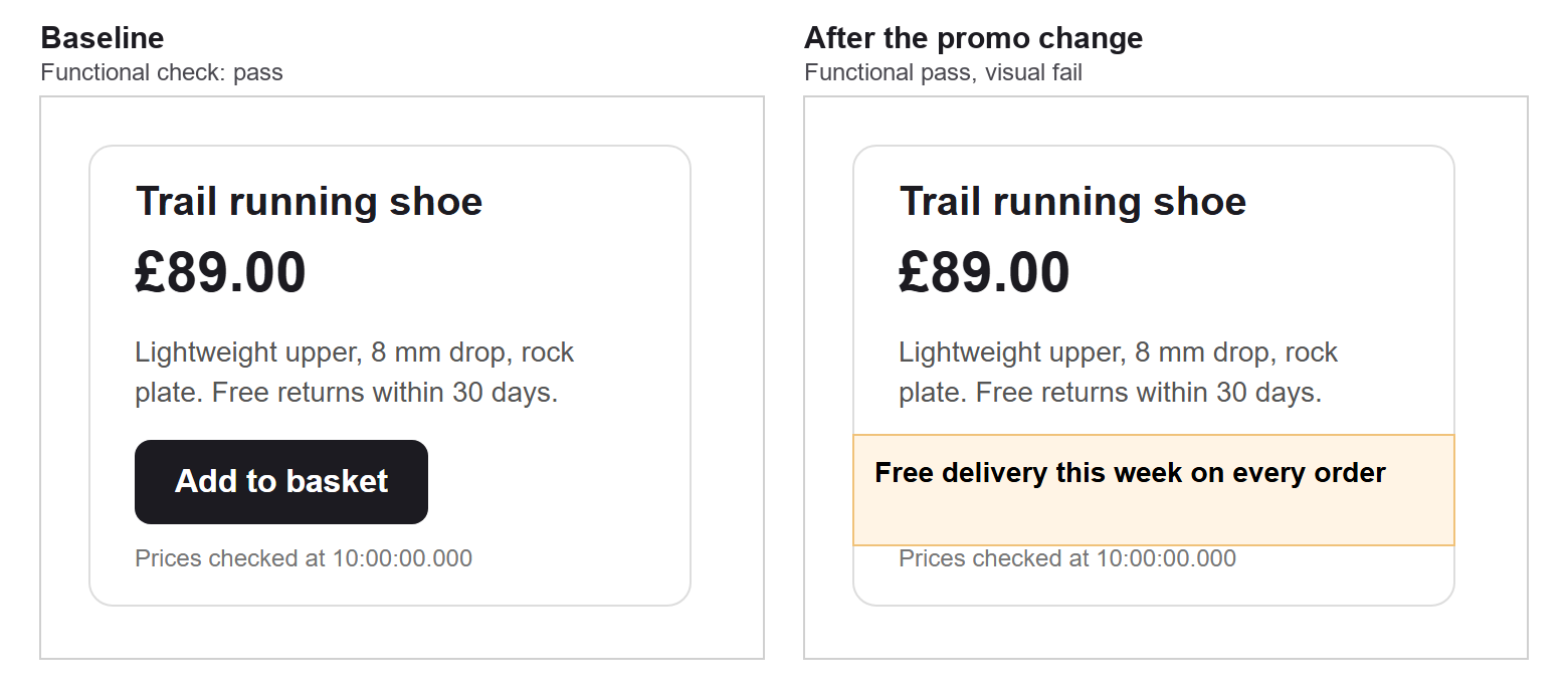
This is the case that justifies visual testing on its own. The banner covered the button completely, yet the functional check passed in both browsers. Playwright's actionability rules explain why. An element counts as visible when it "has non-empty bounding box and does not have visibility:hidden computed style". Nothing in that definition asks whether something else is drawn on top. The click check does look for an overlay that "will instead capture the click", but our banner let clicks pass through, so the button still received them.
The visual check failed at once: 5,889 pixels differed in Chromium and 5,874 in Firefox.
A user would see a promo banner and no way to buy. This kind of defect is common after marketing banners, cookie notices or chat widgets are added to a page by a team that never runs the purchase journey.
A 2 px layout shift
Growing the padding by 2 px at the top and bottom moved the card's contents down and made the card 4 px taller. The default visual check failed with 3,254 changed pixels in Chromium and 3,132 in Firefox. A 2 px shift is easy to miss by eye in a review, but on a busy page it is often the first sign of a broken layout, such as text that will wrap on a smaller screen.
Tuning sensitivity: a change no one can see
The tint is the opposite case. Two units of colour change are invisible to the eye, and at Playwright's default threshold of 0.2 the visual check passed. Playwright describes threshold as "an acceptable perceived color difference in the YIQ color space", from 0 (strict) to 1 (lax).
At threshold 0, the same change failed with 1,237 pixels in Chromium and 1,371 in Firefox.
Strict is not automatically better. A threshold of 0 turns harmless rendering noise into failures, and a team that sees false alarms every day stops reading them. Start with the default, and tighten the threshold only for elements where exact colour matters, such as a brand logo or a status colour.
Also Read: Why Are Extensive Test Coverage Techniques Necessary in QA?
Where visual testing goes wrong
Dynamic content
The live clock changed a few characters of small text, and the default visual check failed every time: 104 pixels in Chromium and 83 in Firefox. Nothing was wrong with the page. Left alone, a check like this teaches the team to ignore red builds.
Masking fixes it. Playwright's mask option covers chosen elements with a solid box, by default pink #FF00FF, in both the baseline and the new screenshot. With the timestamp masked, the check passed in both browsers.
Mask only what changes on purpose: dates, live prices, adverts, user avatars, animated charts. Every mask is a part of the page you have stopped testing. Playwright also disables CSS animations and hides the text caret by default when it takes a screenshot, which removes two other common sources of noise.
Different browsers, different pixels
We compared the Chromium baseline of the unchanged card with the Firefox baseline. At the default threshold, 1,304 of 129,600 pixels differed, about 1%, from font rendering alone.
That is why Playwright names baselines by browser and platform, such as card-chromium-win32.png. Its guide warns that rendering "can vary based on the host OS, version, settings, hardware, power source", and recommends running tests "in the same environment where the baseline screenshots were generated". In practice, generate baselines in the same container your CI pipeline uses, not on a developer laptop.
Pages too large to review
A full-page screenshot of a long page produces a diff that nobody can read. Compare components instead: a header, a product card, a checkout summary. Smaller images give smaller, clearer diffs, and a failure points straight at the part of the page that changed.
In Playwright, the same assertion works on a locator as well as a page. Point it at one element, and only that element is captured and compared:
await expect(page.locator(".card")).toHaveScreenshot("card-only.png");We ran that line against the same changes. It passed on the unchanged page and failed on the hidden button with the same 5,889 changed pixels. On the padding change it failed before comparing a single pixel: "Expected an image 300px by 231px, received 300px by 235px." A change in an element's size is often the clearest sign of a layout problem.
Component screenshots also survive unrelated changes elsewhere on the page. A new footer link will not fail the product card test, so the failures you do see are about the component you are looking at. Name each snapshot after the component and state it shows, such as basket-with-discount.png, so a failing diff explains itself before anyone opens it.
What visual testing will not tell you
A visual test answers one question: does the page look the same as the approved baseline? It does not ask whether the baseline was right.
Our own card showed this. When we checked its colours against WCAG 2.2, the small grey timestamp, #777777 on white, measured 4.48:1. Success criterion 1.4.3 requires "a contrast ratio of at least 4.5:1" for normal text. We did not pick that grey to fail; we found it while checking. Every visual check in the experiment approved it, because it matched the baseline.
The rest of the card passed comfortably: the description at 7.46:1, the heading and price at 17.10:1 and the button text at 17.10:1. The lesson is about scope. Pair visual tests with accessibility checks, and review a new baseline with the same care as a design review, because whatever you approve becomes the standard every later run defends.
Plan which screens to cover
You cannot baseline every state of every page, so choose. Start with the journeys that earn money or cause support tickets: sign-up, search, product pages, basket and checkout. Then add the screens most exposed to change, such as pages where marketing teams add banners.
Mapping journeys before you write tests helps here. Some teams sketch them with AI-powered storyboarding tools to agree which states matter, such as an empty basket, a basket with a discount and a failed payment. Each agreed state becomes one screenshot test.
Visual checks also matter outside the website. Marketing emails render differently in each email client, and visual testing of templates catches broken layouts before a campaign goes out.
Visual testing tools in 2027
The earlier version of this post recommended seven tools. We checked each one in October 2026, and two no longer exist.
- TestProject reached end of life on 31 March 2022, according to Katalon's migration guide.
- Wraith, the BBC's screenshot comparison tool, has a repository archived on 16 January 2026 and marked "no longer maintained".
- Percy has been part of BrowserStack since BrowserStack announced the acquisition on 9 July 2020.
If your stack already uses Playwright, its built-in comparison is the quickest start, as this experiment shows. Cypress captures screenshots, and its own documentation describes comparison through visual testing tools and services rather than a built-in command. Selenium and Puppeteer take screenshots too, but you add the comparison yourself or through a service.
Hosted services such as Percy and Applitools add what a code-only setup lacks: a shared review screen, approval workflows and history. Choose one when several people need to review changes, or when you need many browsers and devices without maintaining them yourself.
Automation testing suites gain the most when visual checks run in the same pipeline as the functional tests, so one build reports both kinds of failure.
Also Read: Different Techniques for AI Chatbot Testing
The principles that keep visual tests useful
Most visual suites that teams abandon fail for the same reasons: too many false alarms and no one responsible for the review. These principles, each shown in the experiment above, prevent both.
- Control the environment. Run every comparison in the same browser version, operating system and screen size as the baseline. Our two browsers differed by about 1% on an unchanged page.
- Make the state repeatable. Fix the test data, freeze or mask anything time-based, and let the tool disable animations.
- Compare small, meaningful areas. A component screenshot fails for one reason; a full page fails for ten.
- Keep the default threshold until you have a reason. Tighten it only where exact colour matters.
- Prove each check can fail. Break the page once on purpose and confirm the test goes red.
- Give every diff an owner. Decide who approves baseline changes, the same way someone approves code.
Before you trust a visual test
Our first attempt at the hidden-button change was wrong. The banner sat below the button, so the functional check passed for a good reason, and we nearly reported it as a missed defect. We caught it only by measuring the position of each element. Prove your own visual tests the same way: break the page on purpose once, and confirm that the check goes red for the reason you expect.
Make visual testing part of every release
Add visual checks where a broken look costs you most, start with default settings, mask only what changes on purpose and keep one baseline per browser and environment. Review every diff, and update baselines only for changes you meant to make.
If you want help setting up visual testing alongside your functional suite, QAble works as a leading QA testing company and QA Consulting Company in India for product teams that need both.